ENGAGING EMAILS
ENGAGING EMAILS
With an influx of emails hitting an inbox every day, it is important that they are engaging and hitting the purpose of why they are being sent. I have taken two emails and redesigned where I felt a better journey could be created that displayed the products better and encouraged positive action with clear CTA’s. Designed using Figma.
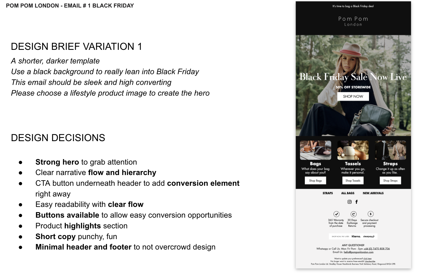
POM POM LONDON
Email Marketing Template Revamp for BFCM
As the Black Friday and Cyber Monday (BFCM) season approached, POM POM recognized the crucial need to revamp their email marketing templates to stand out in a crowded inbox. The goal was to create eye-catching, engaging, and conversion-focused email designs that would resonate with their audience and entice them to take action.
To achieve this, POM POM's email marketing revamp strategy focused on several key elements:
1. Relevant and Compelling Content: The revamped email templates highlighted irresistible BFCM deals, exclusive offers, and limited-time promotions to captivate the audience's attention.
2. Visually Stunning Design: Utilizing vibrant visuals, customized graphics, and sleek layouts, the revamped templates aimed to create a visually appealing and memorable brand experience for recipients.
3. Clear Call-to-Action (CTA): Each email template incorporated clear and concise CTAs that guided recipients towards the desired action, whether it was making a purchase, exploring the product catalog, or joining exclusive events.
4. Personalization and Segmentation: POM POM leveraged customer data to personalize content and tailor offers based on each recipient's preferences and past interactions with the brand.
5. Mobile Optimization: Recognizing the prevalence of mobile email consumption, the revamped templates were designed to ensure a seamless and engaging experience across various devices and screen sizes.
FULL PRESENTATION DECK HERE


Store Front Email

Before
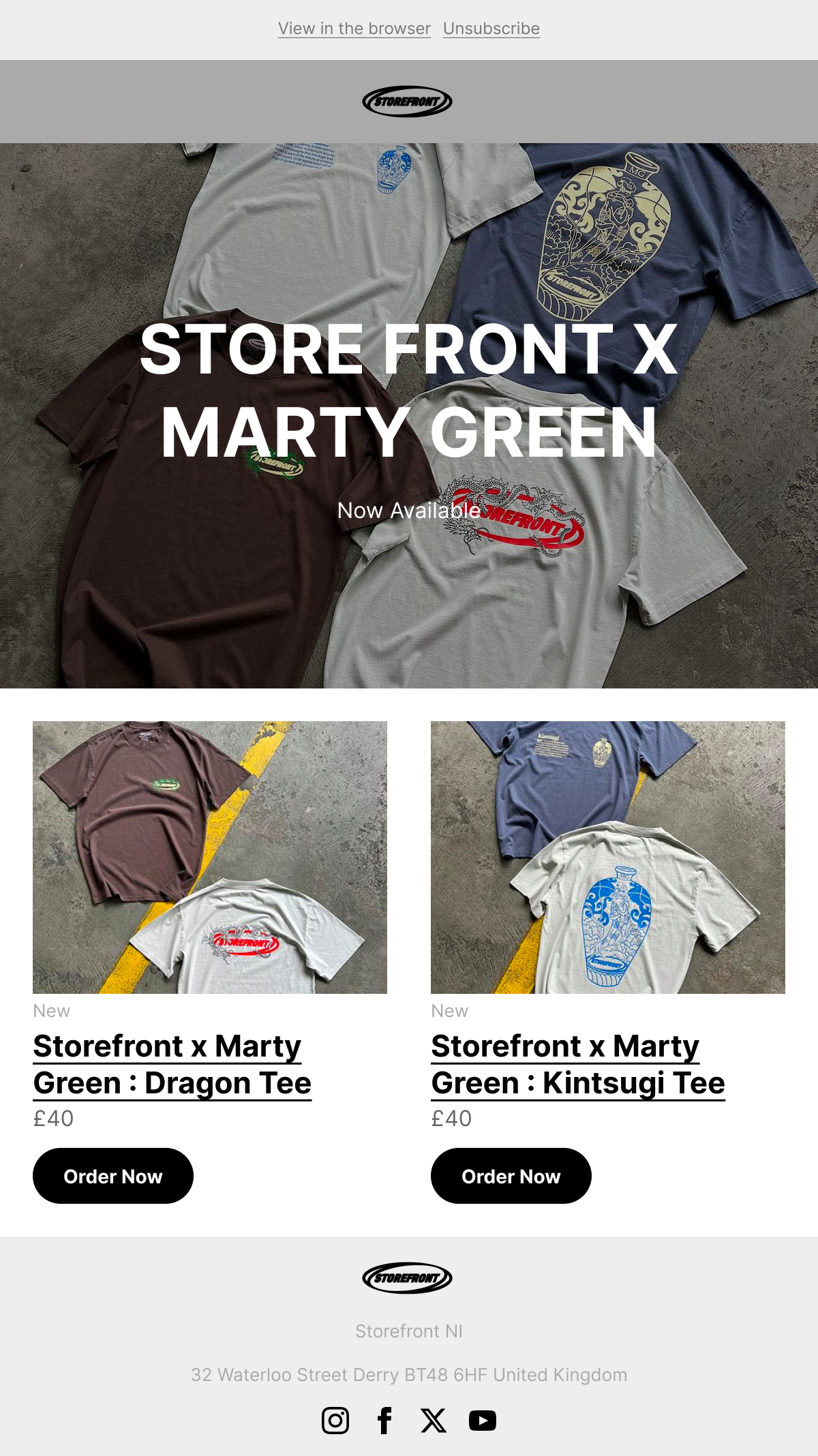
After
Subject: Improved Email Design for Enhanced Engagement
An updated email design that focuses on enhancing user engagement and clarity. The adjustments made are crafted to provide a more polished and effective communication medium with their subscribers.
Here are the key enhancements:
1. Refined Banner: The grey colour in the banner has been subtly adjusted to create a brighter and more inviting opening to the email.
2. Clear Text Announcement: A clear text announcement overlay has been strategically placed above the fold, ensuring that the subscriber immediately comprehends the purpose of the email.
3. Optimized Image Presentation: Images have been cropped to eliminate unnecessary space and emphasize the products, improving visual appeal and directing attention efficiently.
4. Enhanced Product Descriptions: Clear and direct links to the products have been incorporated within the product profiles, accompanied by prominent call-to-action (CTA) buttons for seamless access.
5. Footer Refinement: The footer now employs a brighter grey, along with centralized alignment for pertinent information, imparting a more professional appearance to the email.
6. Optimized Layout and Transparency: The removal of the default text, repositioning of the unsubscribe tab for transparency, and the inclusion of social links for added validity elevate the overall user experience.
7. Streamlined User Interaction: Notably, all images are now linked directly to the respective product sites, ensuring a seamless transition from email engagement to product browsing.
The redesigned email emphasizes a clear and compelling call to action, ensuring that our subscribers are provided with pertinent information in a visually appealing and easily navigable format.
Etsy Email

Before
After

Email Design Enhancement: To enhance the email design, I have incorporated several key elements to ensure a more visually appealing and user-friendly format. By utilizing the same colour palette and introducing curved section endings, I aim to create a seamless flow within the lengthy, informative content.
Improved Header Layout: The right alignment of the header tabs has been strategically adjusted to provide a more intuitive and visually pleasing arrangement. This enhancement eliminates any potential dissonance and ensures a smoother transition for the recipients.
Hero Image and Gallery: Introducing a captivating header to the hero image, positioned above the fold, promises to captivate the reader's interest, offering a glimpse of what lies ahead. Furthermore, the transition to a masonry gallery, as opposed to a split approach for images, reflects a more deliberate and sophisticated design ethos.
Enhanced Call-to-Action: Bold buttons have been introduced to ensure they command the attention they deserve, eliminating any risk of getting lost within the email layout. Additionally, the use of a clear CTA button facilitates a better understanding of the purpose within the "Why small businesses" block.
Testimonial and Sales Sections: The inclusion of a profile image within the testimonial section imparts a more personal touch, elevating its impact beyond a traditional quote section. Moreover, the introduction of clear headers has enhanced the clarity of the "sale" section, ensuring it resonates more effectively with the readers.
Footer Revamp: An effortless refinement of the footer, with a centered alignment, has been implemented to harmonize with the overall fluidity of the email design, providing a polished conclusion to the recipient's experience.